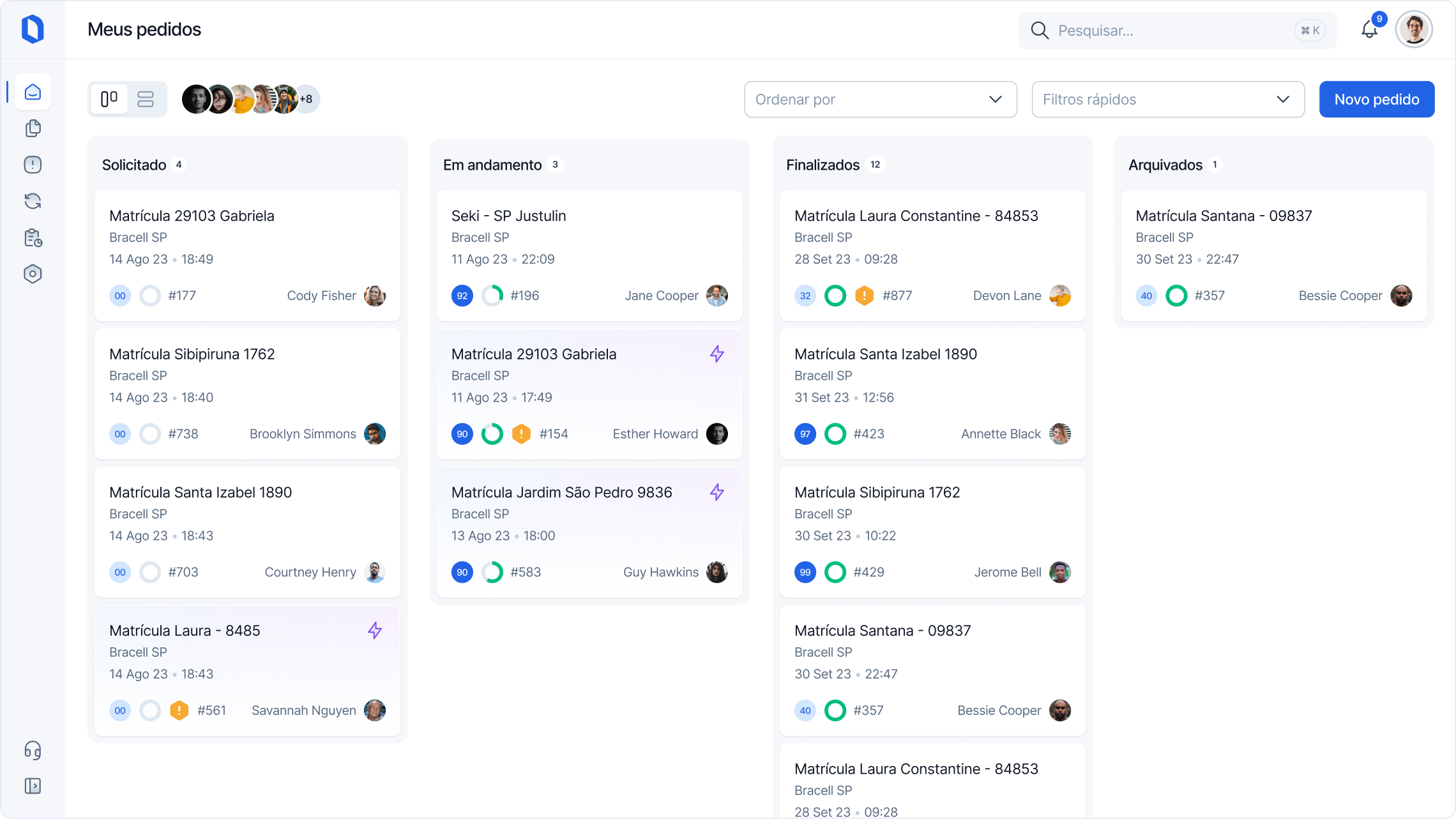
As a Design Lead/Specialist, I led the team to the new design system construction and revamp the Saas company, which was facing an increase in churn. The product was complex to use, hard to navigate and the interface wasn't consistence. My role was to simplify the interface using new and modern design patterns and look and fill, decrease the churn rate, and improve the usability

We conducted client visits across the country to gain insights into user behaviors and identify challenges with the current system.
We meticulously mapped all the components and variations within the system. For instance, we identified over 30 types of buttons.
We conducted a detailed analysis of industry standards and competitor systems to understand where our system stands and identify areas for improvement.
Developed more than 100 screen concepts to address the challenges identified during field research and benchmarking.
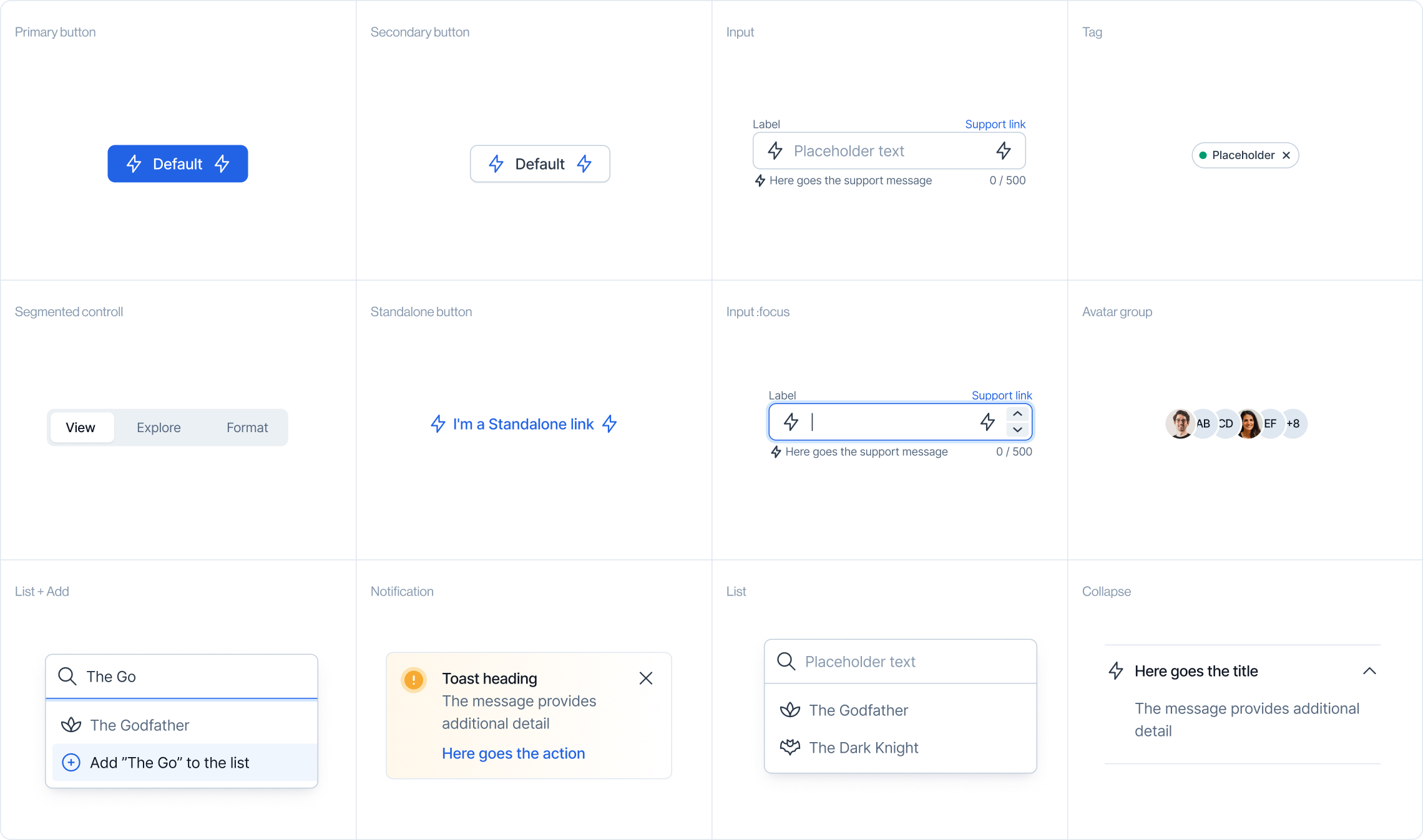
Our focus was on creating a clean interface with clear objectives for each screen, increasing the interface patterns. As a vital work tool, our goal is to streamline the daily routines of our users, improving the time task and decreasing the learning curve of the system.
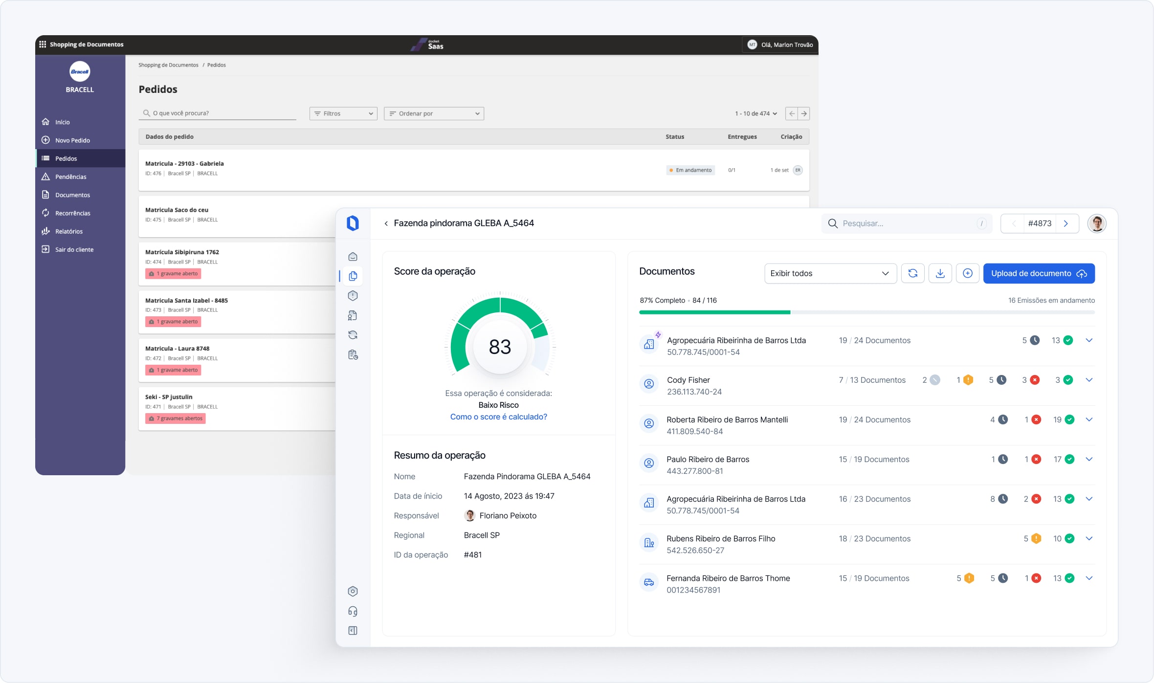
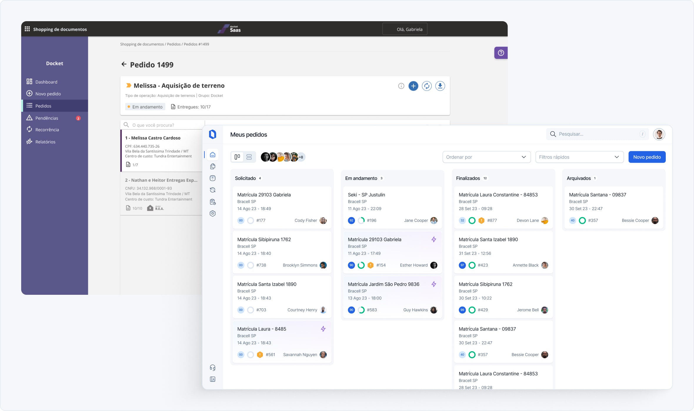
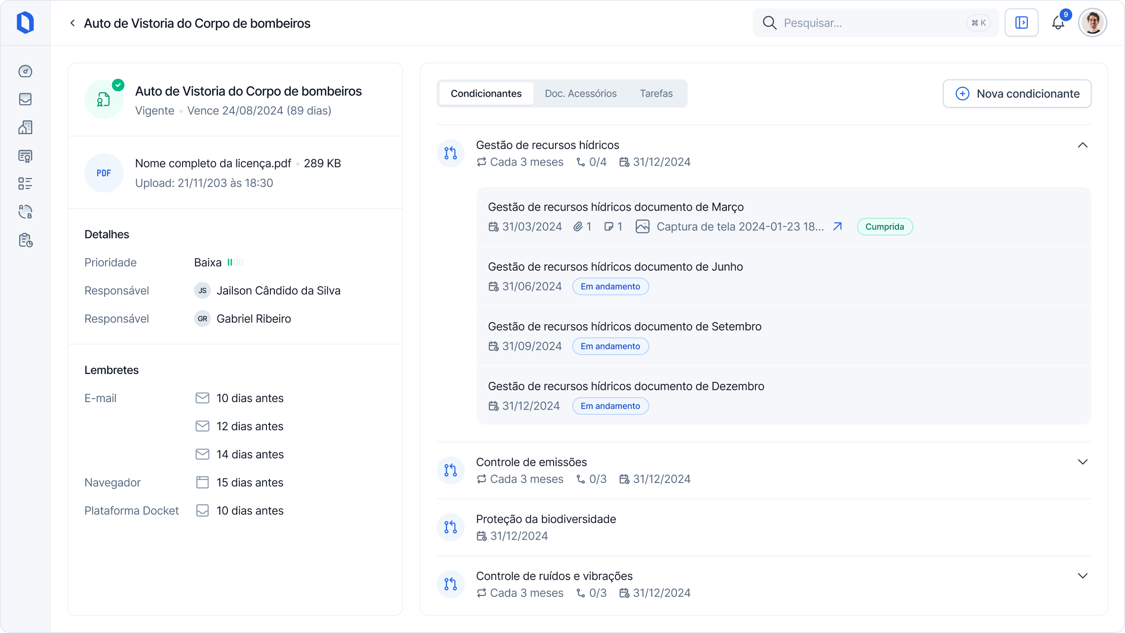
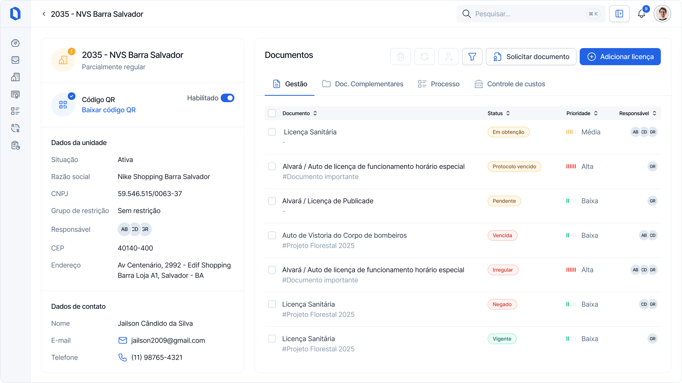
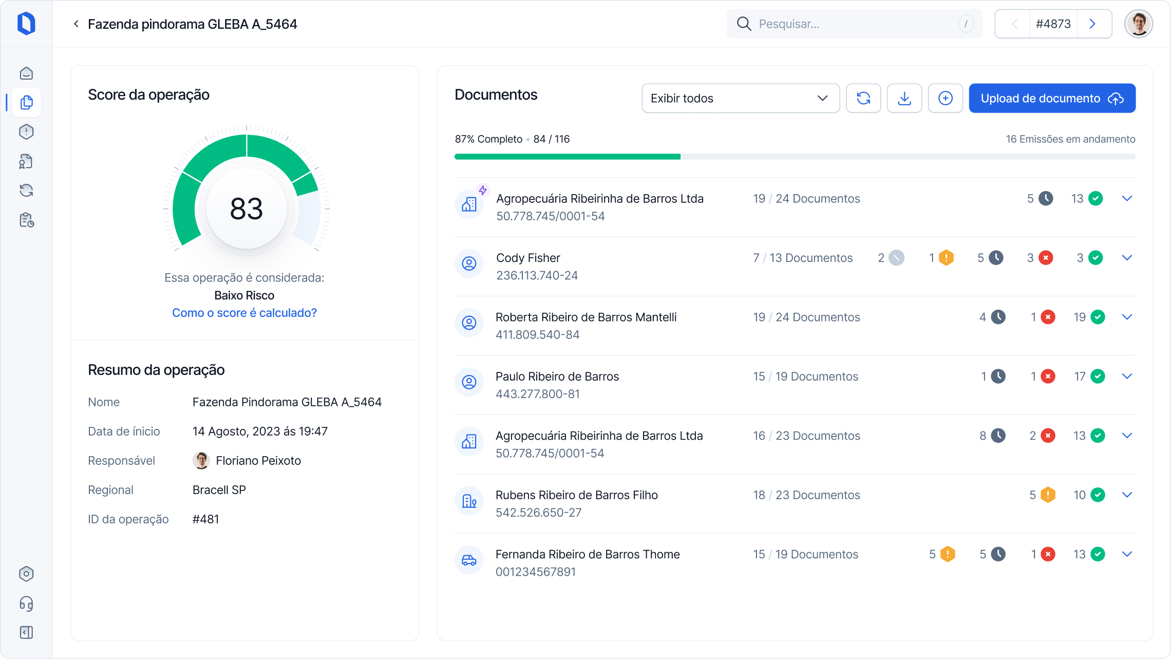
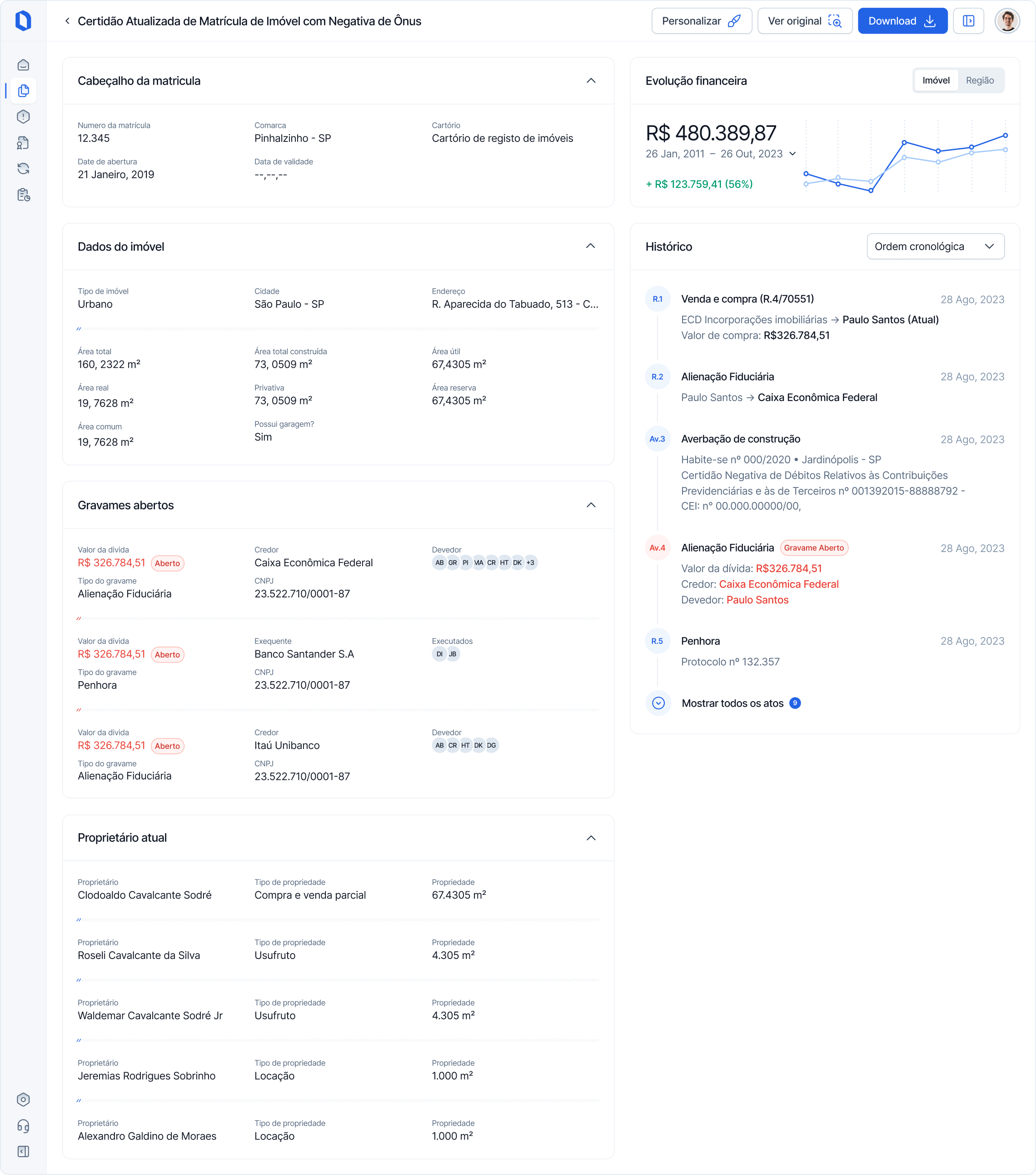
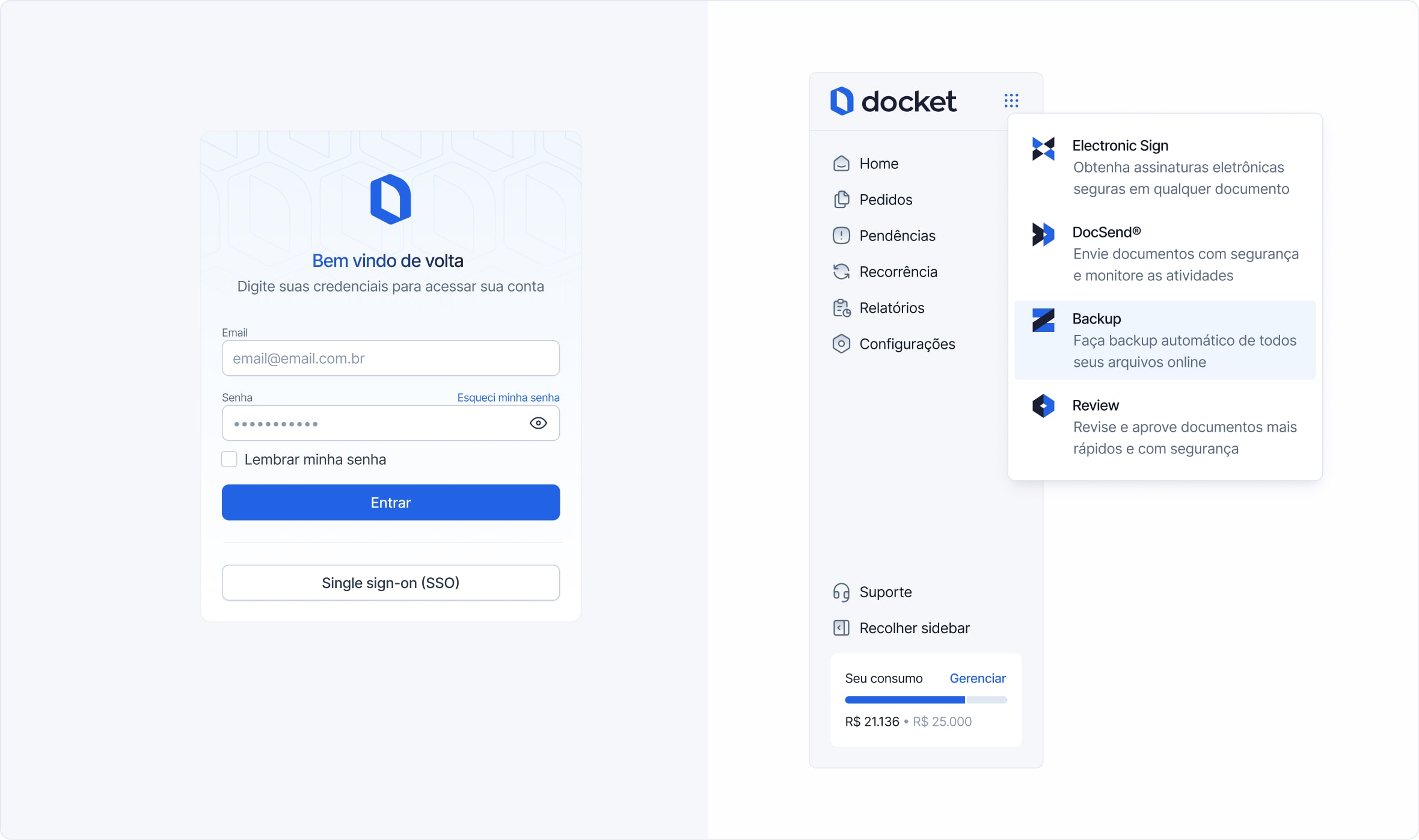
Some of the deliveries, including the Document Analysis page, were received very well by customers, contributing to a 2% increase in Monthly Recurring Revenue (MRR).
The document solicitation flow, with more than 3.3 million documents processed per month, has seen a reduction in task time from 10 minutes to less than 4 minutes.
© 2012 - 2024