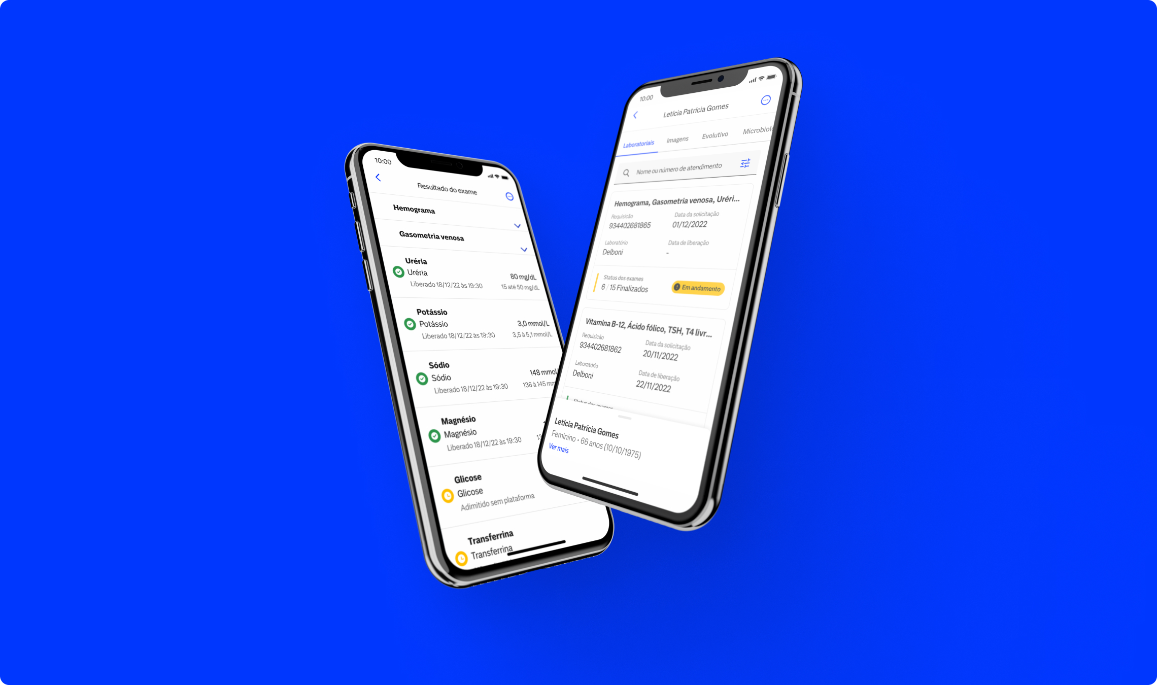
I have worked on several end-to-end initiatives for one of the largest Diagnostic Medicine companies in Latin America. One of these projects involved integrating a patient list from the company’s clinics into an app that previously only displayed patient lists from hospitals. Additionally, improved the exam reading experience—the main app flow—which is used daily by over 4,000 doctors.

Add the clinics patient to the app and improve the exame reading experience (Main App flow) to more than 4.000 Doctors
Read and understand the user comments and rate from the Stores (App Store and Play Store)
Collect and understand feedback inside the App
Watch the navigation recording from Smartlook
Interview the user and Stakeholders
Following the comments, rating from the stores, feedback inside tha pp and the recordings was conducted together with the interview with User and Stakeholdes which take us 1 week to be done by the lack of agenda.
The exam page header is very large and fixed, making navigation and space for viewing exams difficult.
The experience of reading exam results in collapse on the same screen is complex.
It is not possible to access other company services within the app
The experience of reading exam results in PDF on your phone is complex.
Information hierarchy on the exam page does not prioritize exam cards.
The buttons distributed throughout the exam page take up significant space
The information displayed on the exam cards is not enough.
The information displayed about patients is not enough.
It is currently not possible to make any type of prescription in the application (POC Memed).
Changing hospitals (consequently CRM) is difficult and takes place outside the context of the operation.
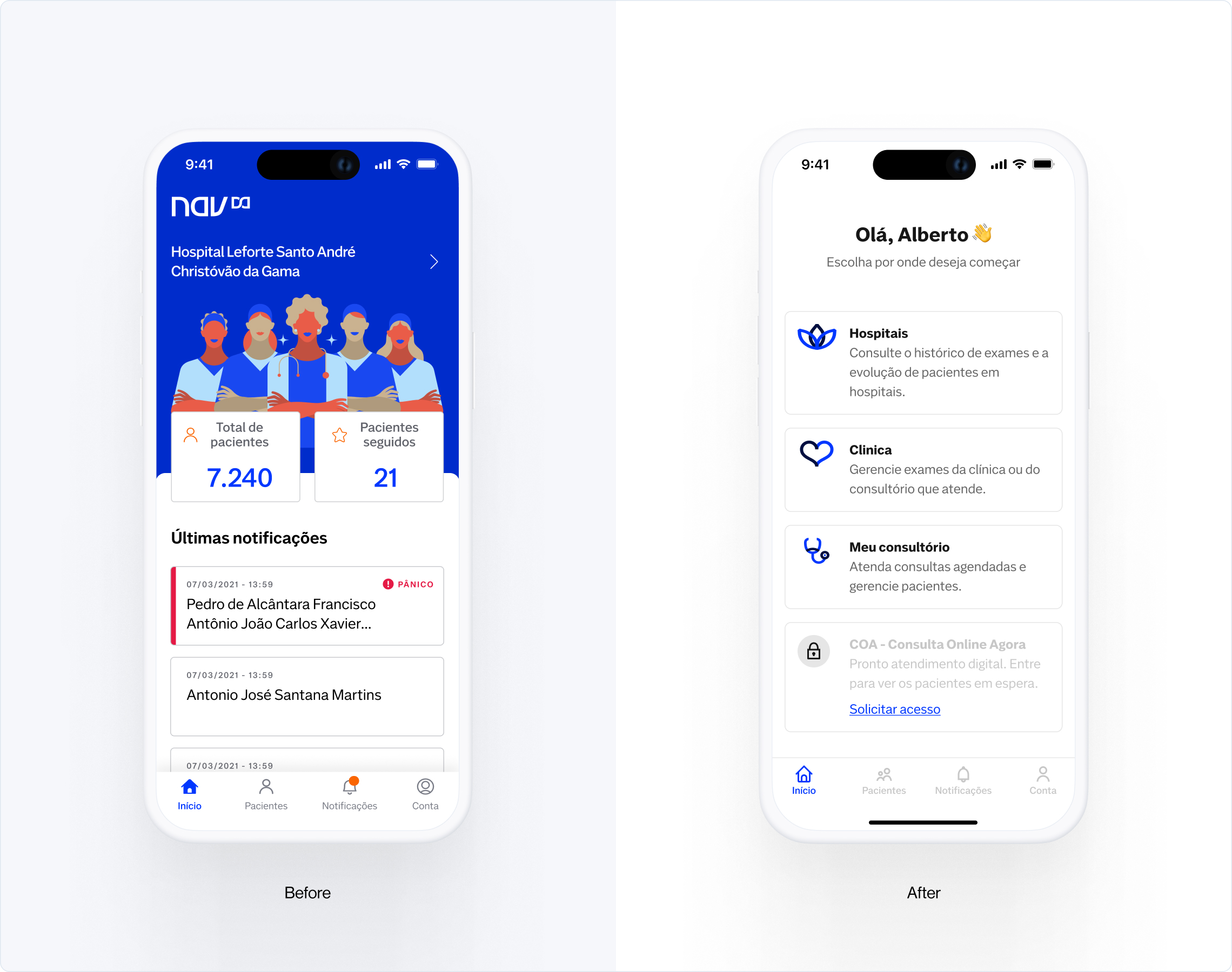
Organizing patient data and test results in a more relevant and uncomplicated way in a new architectural model would improve the app's user experience.
Make adjustments to the hierarchy and architecture of the exam reading flow and perform a usability test.
Success rate in usability testing tasks
Stickiness / Adhesion of product use
Event tracking / Opening the Persistent Bottom Sheet with patient information
Success rate in usability test tasks at least 80%
Stickiness / Minimum 2% increase
Event Tracking / CTR of at least 3%
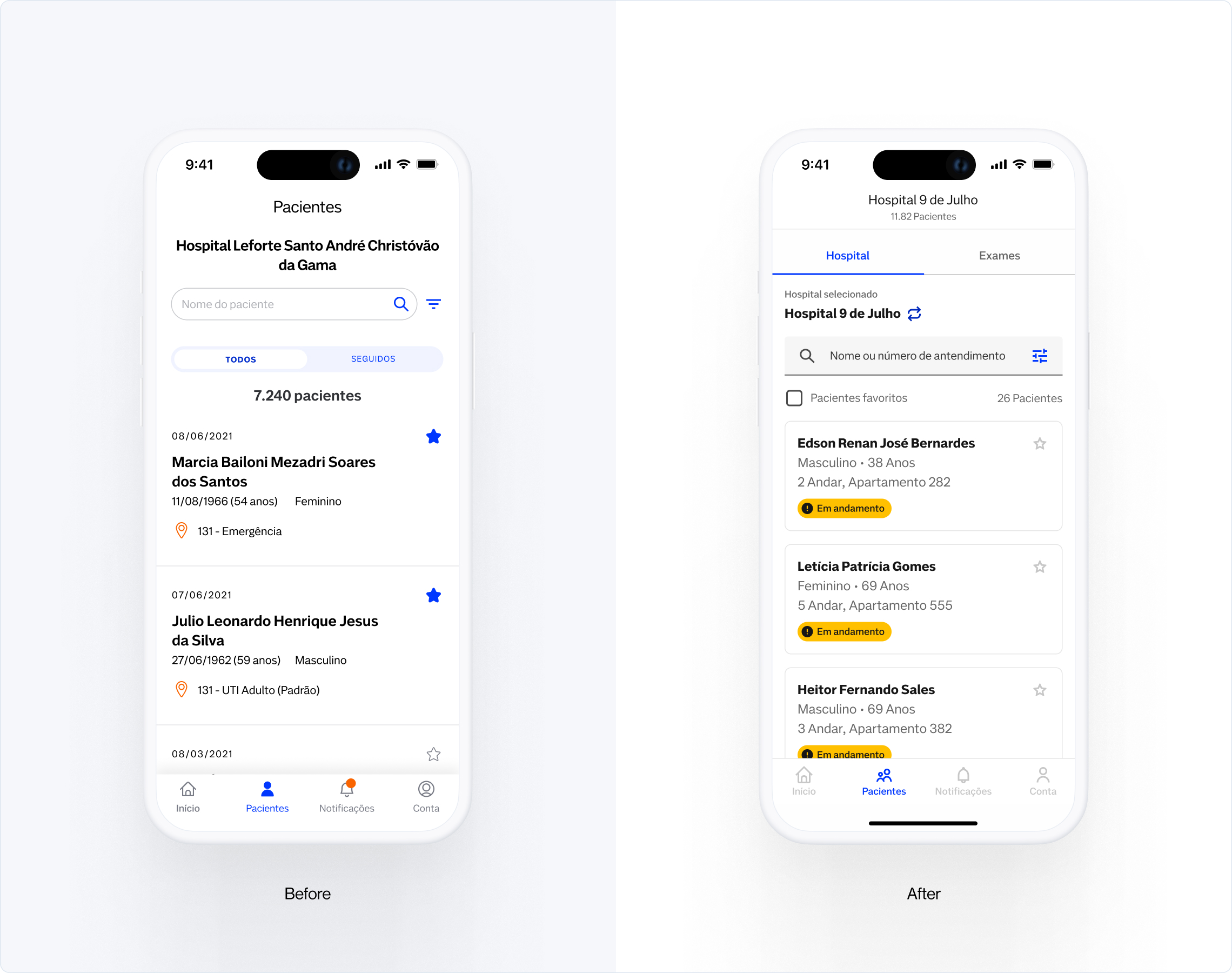
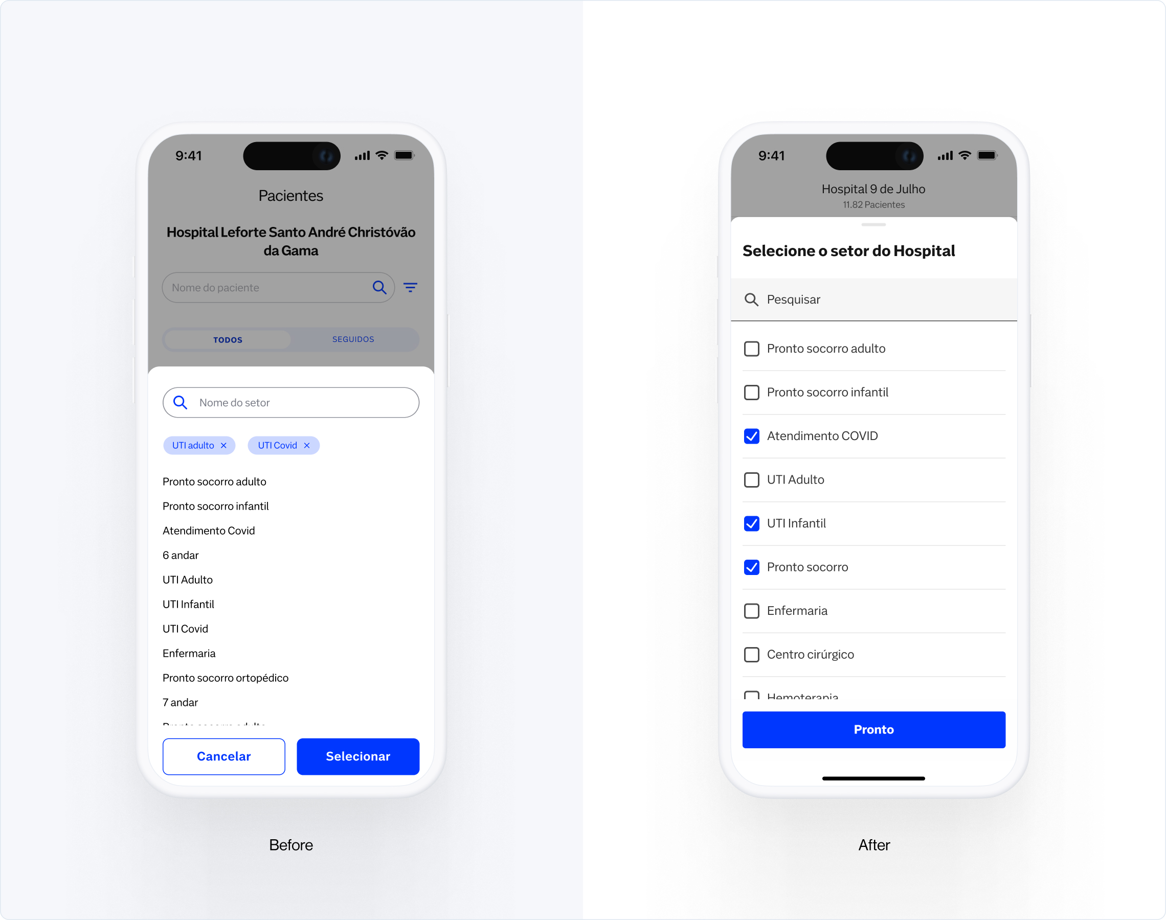
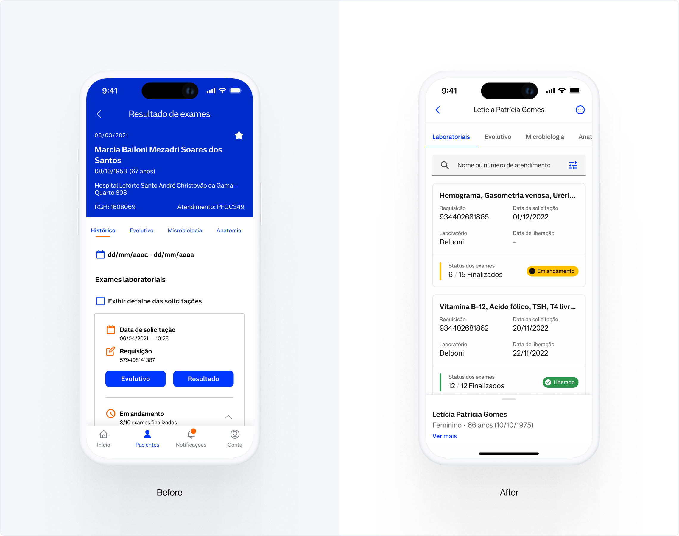
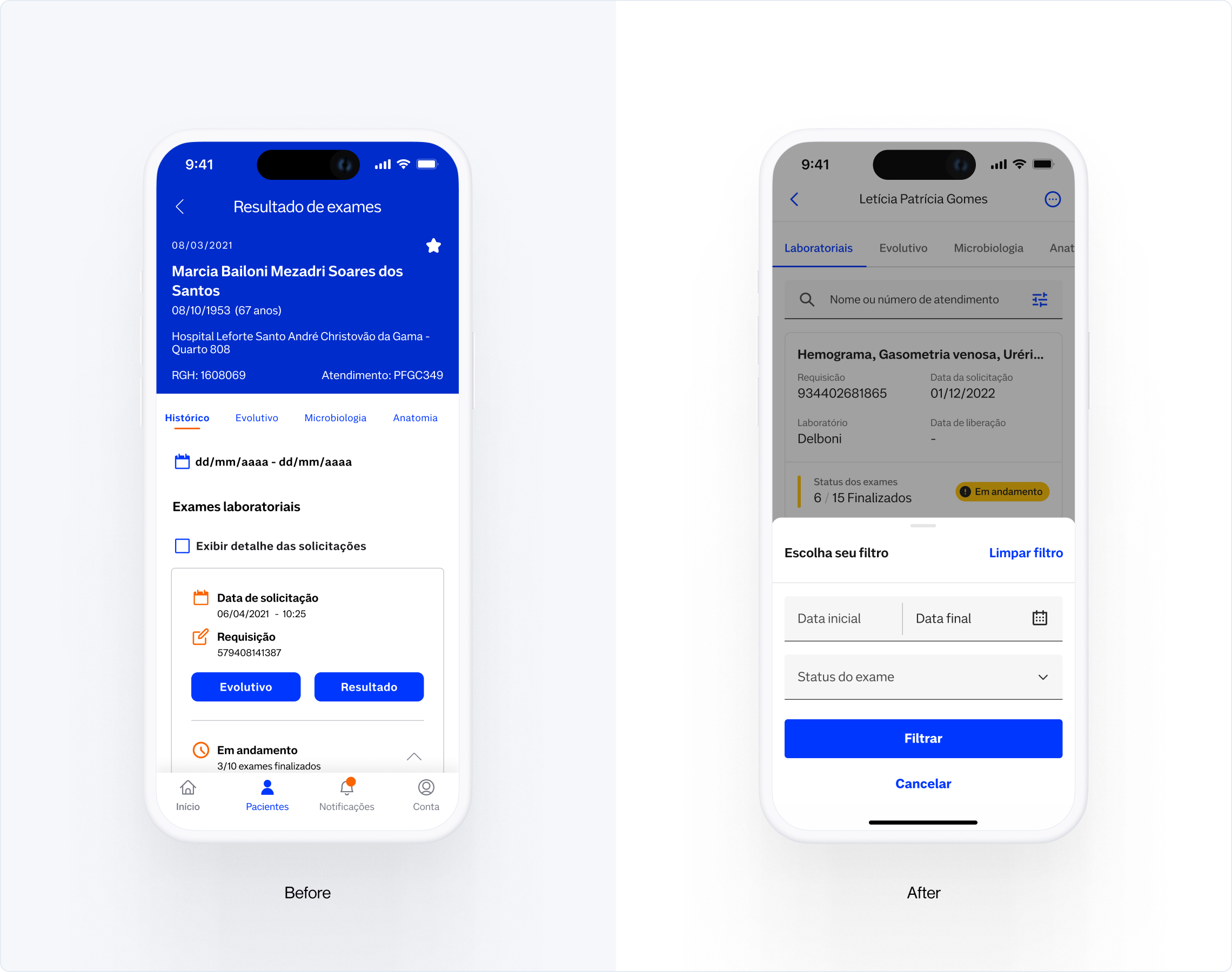
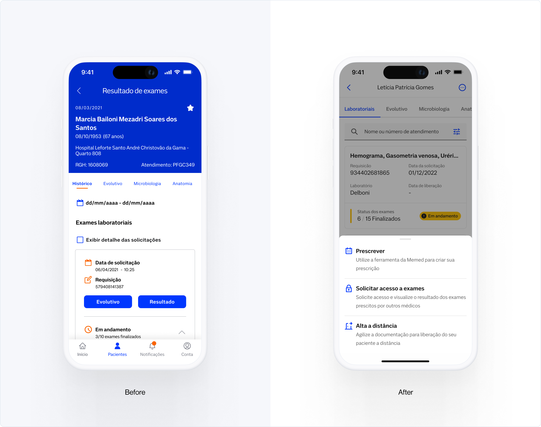
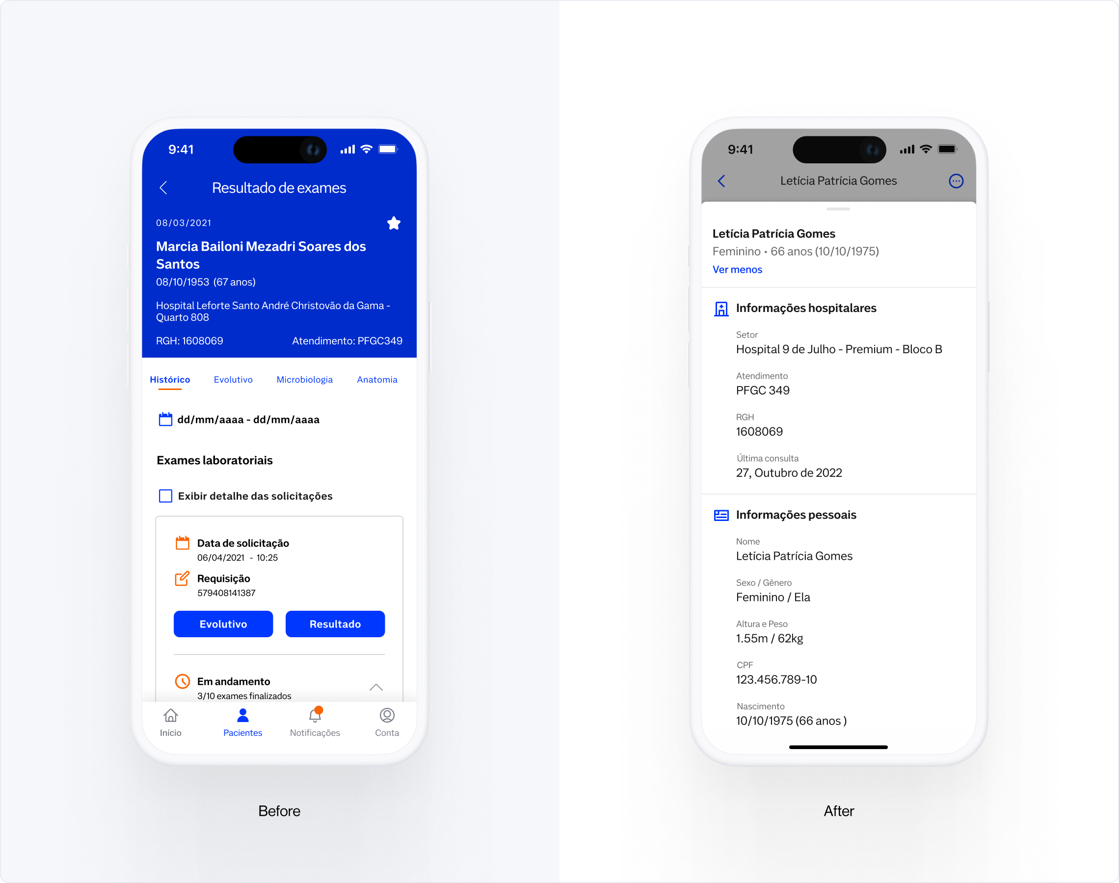
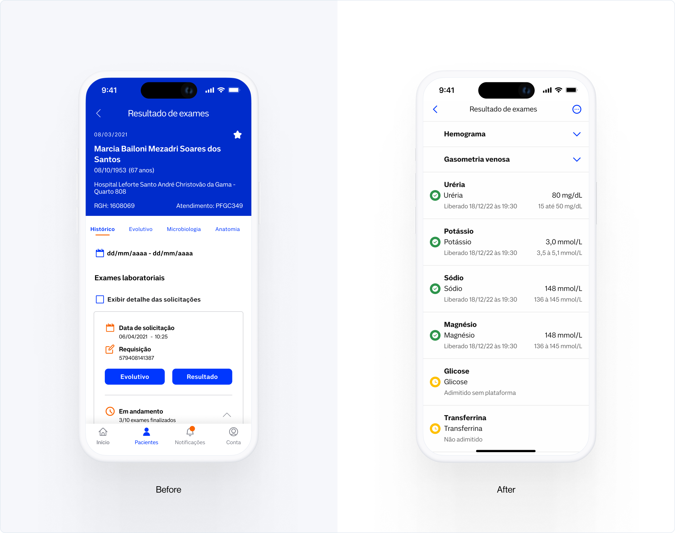
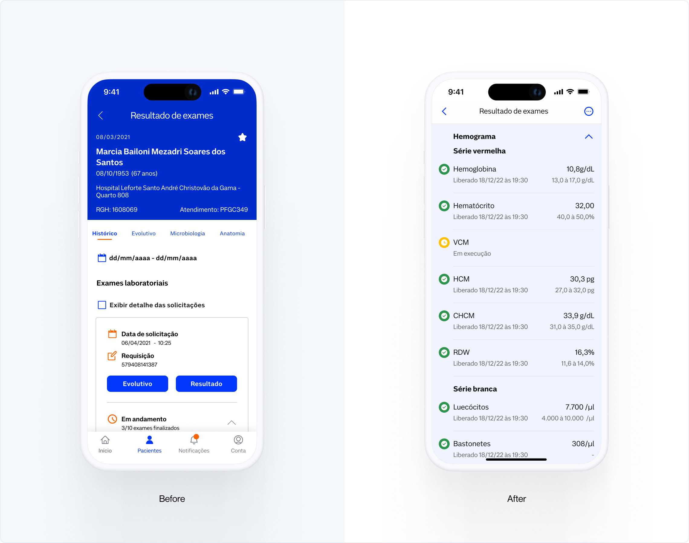
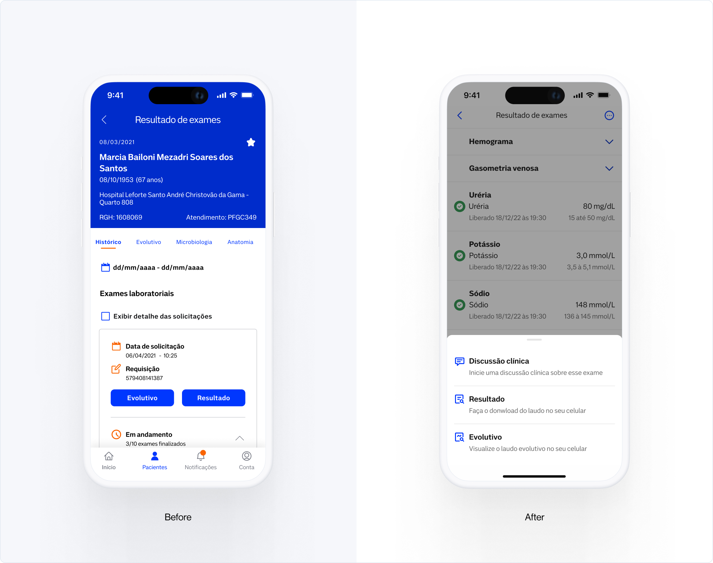
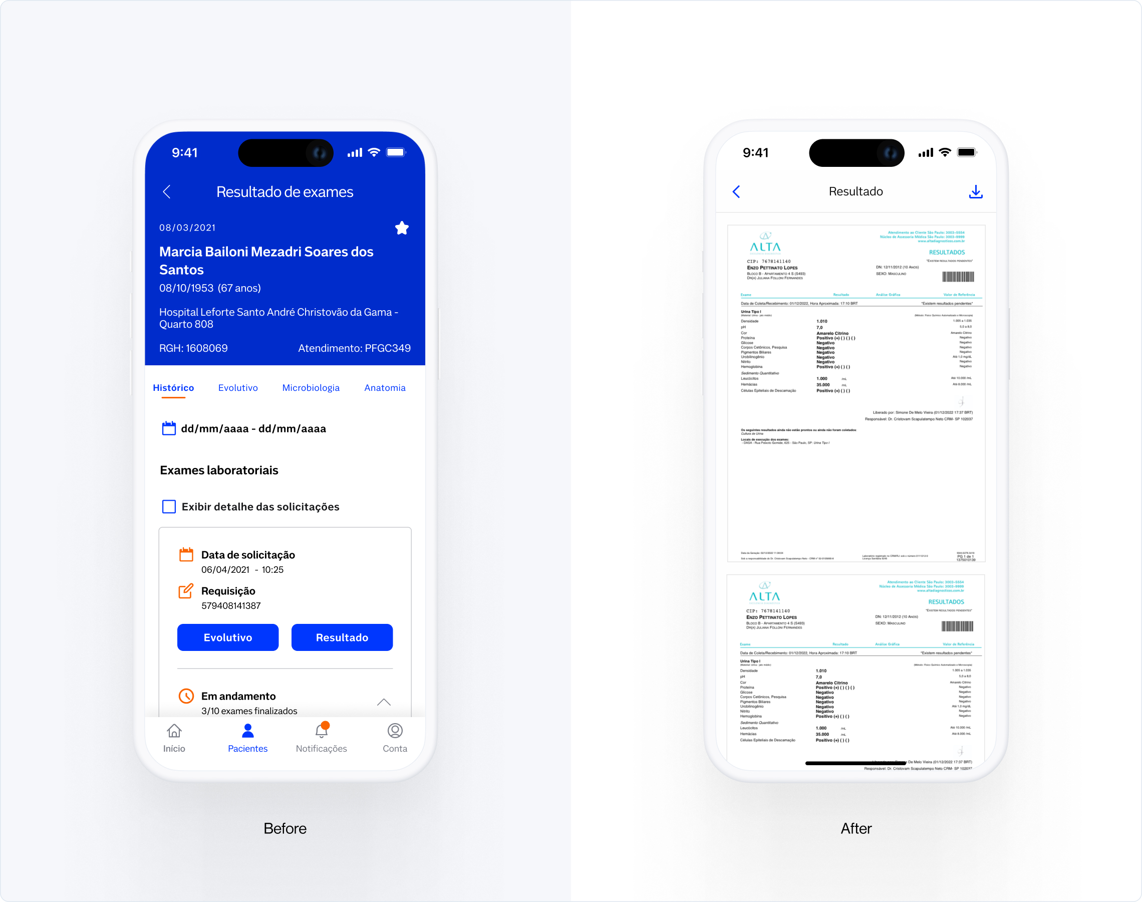
The test was carried out with 5 medical users who already use the app on a daily basis and 3 doctors who had never used the app (habit transfer comparison).
Script / questions were created that “forced” interaction directly with the proposed improvements
Casting / A total of 8 doctors were recruited, all of them Dasa Network employees.
Moderated usability testing
Finding report and presentation to the team about the main results of the test.
Getting 45 minutes in the doctors' schedule was a complicated task, the practice of usability testing with doctors was not very widespread and it was also not possible to provide a bonus to any of the doctors due to Compliance rules.An agenda with 5 doctors already using the app was carried out through Stakeholders and the 3 doctors who were not yet users of the app underwent a “guerrilla” usability test in the hospital cafeteria during free hours (it wasn’t easy lol)
They were able to locate the patient and the proposed exam (Hemogram)
Understand that the position and amount of information about the patient is relevant
They were able to read the exam results within the collapse
They reported that the experience of reading the exam directly on the screen is better, compared to the PDF
Understand how much information on the relevant exam card
Understood the status of the exams on the results page
Managed to locate and interact with the context menu button in the header
Increased Stickiness
CTR Opening the Persistent Bottom Sheet
Time spent on the exam results screen
CTR: Opening context menus in the Header
CTR Opening the exam results before reading in PDF
© 2012 - 2024